Tampilkan postingan dengan label CSS3. Tampilkan semua postingan
This post is the continuation of my previous Responsive Web Design using CSS3. I had explained how to design a basic responsive web page using CSS3 and Modernizr for lower version browsers. In this post we want to explain how to design responsive collapsed navigation menu, images and advertisements grids for different media devices.

Rating: 4.5
Reviewer: Unknown
ItemReviewed: Responsive Web Design for Menu, Image and Advertisements
Smartphone revolution brings new features to the web development, it is time to change your website design into a responsive design instead of maintaining a separate mobile version . Responsive design will automatically adjust itself based on the screen size of the media devices. This post explain you how to use CSS 3 @media property and working with Internet Explorer using Modernizr.

Rating: 4.5
Reviewer: Unknown
ItemReviewed: Responsive Web Design using CSS3

Berbagai teknik dapat dilakukan untuk membuat menu navigasi dalam website, dapat menggunakan javascript, jQuery, mootools dan masih banyak lagi library yang menyediakan plugin untuk menu.
Kali ini ada sedikit contoh membuat animasi dropdown menu menggunakan CSS3.
berikut script dari CSS3 :
<style type="text/css">
.blok_menu {
 height:40px;width:375px;border:0px solid #000;
}
.menu_sub,
.menu_sub ul.kolom,
.menu_sub li.baris,
.menu_sub a.pertama {
 margin: 0;
 border: none;
}
.menu_sub {
 padding: 0;
 margin: 0;
 height: 40px;
 background: #4c4e5a;
 background: -webkit-linear-gradient(top, #4c4e5a 0%,#2c2d33 100%);
 background: -moz-linear-gradient(top, #4c4e5a 0%,#2c2d33 100%);
 background: -o-linear-gradient(top, #4c4e5a 0%,#2c2d33 100%);
 background: -ms-linear-gradient(top, #4c4e5a 0%,#2c2d33 100%);
 background: linear-gradient(top, #4c4e5a 0%,#2c2d33 100%);
}
.menu_sub li.baris {
 position: relative;
 float: left;
 display: block;
 height: 40px;
 width:125px;
}
.menu_sub li.baris a.pertama{
 display: block;
 padding: 0 10px 0 10px;
 margin: 0px 0;
 line-height: 40px;
 text-decoration: none;
 border-left: 1px solid #393942;
 border-right: 1px solid #4f5058;
 font-family: Helvetica, Arial, sans-serif;
 font-weight: bold;
 font-size: 13px;
 color: #f3f3f3;
 text-shadow: 1px 1px 1px rgba(0,0,0,.6);
 -webkit-transition: color .2s ease-in-out;
 -moz-transition: color .2s ease-in-out;
 -o-transition: color .2s ease-in-out;
 -ms-transition: color .2s ease-in-out;
 transition: color .2s ease-in-out;
}
.menu_sub li.baris a.kedua{
 display: block;
 line-height: 28px;
 text-decoration: none;
 border-left: 1px solid #393942;
 border-right: 1px solid #4f5058;
 font-family: Helvetica, Arial, sans-serif;
 font-weight: bold;
 font-size: 13px;
 color: #f3f3f3;
 text-shadow: 1px 1px 1px rgba(0,0,0,.6);
 -webkit-transition: color .2s ease-in-out;
 -moz-transition: color .2s ease-in-out;
 -o-transition: color .2s ease-in-out;
 -ms-transition: color .2s ease-in-out;
 transition: color .2s ease-in-out;
}
.menu_sub li.baris:first-child a.pertama{ border-left: none; }
.menu_sub li.baris:last-child a.pertama{ border-right: none; }
.menu_sub li.baris:hover > a.pertama { color: #8fde62; }
.menu_sub ul.kolom2{
 position: absolute;
 top: 40px;
    padding:0px;
 opacity: 0;
 background: #1f2024;
 -webkit-border-radius: 0 0 5px 5px;
 -moz-border-radius: 0 0 5px 5px;
 border-radius: 0 0 5px 5px;
 -webkit-transition: opacity .25s ease .1s;
 -moz-transition: opacity .25s ease .1s;
 -o-transition: opacity .25s ease .1s;
 -ms-transition: opacity .25s ease .1s;
 transition: opacity .25s ease .1s;
}
.menu_sub li.baris:hover > ul.kolom2 { opacity: 1; }
.menu_sub li.baris2:hover > a.kedua { color: #8fde62; }
.menu_sub ul.kolom2 li.baris2 {
 height: 0;
 overflow: hidden;
 width:105px;
    padding: 0 10px;
 -webkit-transition: height .25s ease .1s;
 -moz-transition: height .25s ease .1s;
 -o-transition: height .25s ease .1s;
 -ms-transition: height .25s ease .1s;
 transition: height .25s ease .1s;
 list-style-type:none;
}
.menu_sub li.baris:hover > ul.kolom2 li.baris2 {
 height: 36px;
 overflow: visible;
    padding: 0 10px;
}
.menu_sub ul.kolom2 li.baris2 a.kedua {
 width: auto;
 padding: 4px 0 4px 0px;
 margin: 0;
 border: none;
 border-bottom: 1px solid #353539;
}
.menu_sub ul.kolom2 li.baris2:last-child a.kedua { border: none; }
</style>
tempatkan CSS di atas di antara head
Kemudian berikut adalah tag HTML untuk menggunakan CSS di atas :
Tempatkan script html di atas kedalam dalam tag body website atau blog anda. Kompabilitas CSS3 telah didukung oleh browser terkini. Demikian sedikit sharenya, selamat mencoba dan semoga berguna.
Kemudian berikut adalah tag HTML untuk menggunakan CSS di atas :
<div class="blok_menu">
 <ul class="menu_sub">
 <li class="baris"><a class="pertama" href="#">Menu 1</a>
 </li>
 <li class="baris"><a class="pertama" href="#">Menu 2</a>
       <ul class="kolom2">
   <li class="baris2"><a class="kedua" href="" >Sub Menu 2.1</a></li>
   <li class="baris2"><a class="kedua" href="" >Sub Menu 2.2</a></li>
   <li class="baris2"><a class="kedua" href="" >Sub Menu 2.3</a></li>
       </ul>
 </li>
 <li class="baris"><a class="pertama" href="#">Menu 3</a>
       <ul class="kolom2">
   <li class="baris2"><a class="kedua" href="" >Sub Menu 3.1</a></li>
   <li class="baris2"><a class="kedua" href="" >Sub Menu 3.2</a></li>
   <li class="baris2"><a class="kedua" href="" >Sub Menu 3.3</a></li>
   <li class="baris2"><a class="kedua" href="" >Sub Menu 3.4</a></li>
   <li class="baris2"><a class="kedua" href="" >Sub Menu 3.5</a></li>
       </ul>
 </li>
 </ul>
</div>
Tempatkan script html di atas kedalam dalam tag body website atau blog anda. Kompabilitas CSS3 telah didukung oleh browser terkini. Demikian sedikit sharenya, selamat mencoba dan semoga berguna.
Rating: 4.5
Reviewer: Unknown
ItemReviewed: Membuat drop down menu sederhana dengan CSS3
This post is very basic level Jquery and CSS implementation. I want to explain how to design simple drop down menu with CSS, HTML and Jquery. This system helps you to minimise the menus list. Just take a quick look at this post very few lines of code, use it and enrich your web projects.

Rating: 4.5
Reviewer: Unknown
ItemReviewed: Simple Drop Down Menu with Jquery and CSS
Bootstrap is a toolkit, which is developed by the Twitter team. This actually helps you to develop web applications much faster.Bootstrap contains CSS and Javascript files using which you can enrich your web page with Grids, Layouts, Typography, Tables, Forms, Navigation, Alerts etc,. This avoids cross browser compatibility problem. This time I am aiming to explain how to design a template of the basic fluid blog for different resolutions and devices like iPad and iPhone.
.
.
Rating: 4.5
Reviewer: Unknown
ItemReviewed: Bootstrap Tutorial for Blog Design.
Back then we used graphic design softwares like photoshop to design logos and icons. But now we can design almost anything using the power of CSS3. Designing logos and icons using Cascading Style Sheets will make your site load faster than using images. Today i am going discuss how to design CSS3 logo using basic properties.

Rating: 4.5
Reviewer: Unknown
ItemReviewed: CSS3 Logo Design
Introducing a new jQuery AnchorCloud Link Identifier plugin, This helps make better and enrich link expanding system for your web content pages. This plugin developed using yahoo query language(YQL) for extracting website content like page title and description. First version supports we included Youtube and Vimeo, next release we are planning to include some more popular video and photo services.

Rating: 4.5
Reviewer: Unknown
ItemReviewed: Jquery AnchorCloud Expanding Link Plugin.
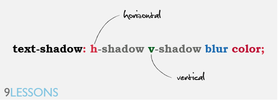
This post is explains how to create Photoshop style 3D text effects using CSS3 text-shadow and @font-face property. These properties are supported in all modern browsers like Chrome, Safari and Firefox, except Internet Explorer is dead. Try following examples and enrich your web pages, use better color combinations for pretty results
Rating: 4.5
Reviewer: Unknown
ItemReviewed: Text Effects using CSS3
Google plus given an awesome kick to user experience, specially circles UI animations. I feel it’s great and new definition to have user experience design. I have tried circle rotation animation effect with Jquery and CSS3. Just few lines of code applying CSS styles using jQuery methods like .addClass() and .animation(). Take a look at these live demos with modern brewers.

Read more »
Rating: 4.5
Reviewer: Unknown
ItemReviewed: Google Plus Style Animations with Jquery and CSS3


